Showing posts with label UNIT23 P4. Show all posts

Wednesday, 12 January 2011

Camera Shots and Editing Practice

I used a Flip Video Camera to practice getting different shots. The Flip Video Camera is a small easy to use camera with zoom functions and high quality recordings. This camera can be used effectively on a tripod, taking good panning shots. However it isn't very useful for changing the focus length as it doesn't have this function.


I used the camera, a tripod and iMovie to create a short video. I did this by first filming different shots outside the college. When taking shots I waited ten seconds after pressing play to leave time for the camera to steady and time for editing later. I also took about three takes for each shots so that i could use the best take when editing. Any piece of footage that I didn't need would be edited out later. 
My first shot was a tilt shot from high to low, I zoomed in on this shot so that there was more detail on the sculpture. The term 'tilt shot' in filming means the camera moves up and down on the same axis without moving left or right. The term 'zoom' means the camera is focusing on something closer than normal without moving from the original spot the shot was taken. My next shot was a pan from right to left. The term 'pan shot' means that the camera is moving from left to right or right to left. I then practiced doing another tilt shot but this was from low to high. I finished with a pan shot from left to right. When I was filming I was careful about health and safety. I didn't film on the path so that the tripod wasn't a hazard to anybody walking past. Also I was careful that the area i was working on was level so that the camera didn't fall over or sink into the wet ground.


Once I had my footage I uploaded it to the computer and used iMovie to edit and put together what I had done.
I did this by importing the separate videos from the camera.


I then selected the piece of footage I wanted from each clip by highlighting the bit i wanted. I then dragged it into the video.
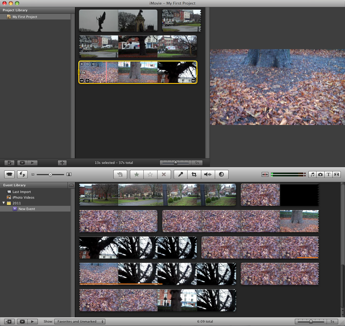


Once the video had been put together and I was happy with it, I then selected 'Share' and exported it as a QuickTime Movie. This then gives the option to change advanced settings such as sound quality and screen quality. These settings can be changed depending on whether the video is going to be higher quality or faster export. After changing these options to what I wanted I named it and then saved it.

Wednesday, 5 January 2011

Stop Motion Video


This is a stop motion video I helped to create and finish. As a graphics design student my role in this video was to create the ending credits. I created this using iMovie and Dafont.com, I used this site to find an appropriate font for the video. I  created a list of the people involved in the video and their assigned role. Then I  presented them as scrolling credits.

If i was to create credits again I would improve this by finding a more effective font and add a background to the credits page. I would also create an opening title screen.


By Alex Wood :) 

Wednesday, 13 October 2010

Album Covers


Album Covers

 Band: Dark Moor
Album: The Older I Get
 Band: Combination
Album: Summer Afternoon, Summer Afternoon
 Band: Fridays
Album: The Freedom Of All
 Band: House At Lawrence Avenue
Album: The World Is Full
Band: Theory
Album: There Are No Secrets

Album Covers I have designed, I did this by selecting a random image from Flikr to use as the album cover image. Then I selected a random page on Wikipedia and used the subject as the name of the band. After, I selected a random quote from the internet and used the first four words of the quote as the album name. I finally used this information to create an album cover on photoshop. I did this for each album.

On my first design I matched the colours of the image with the fonts, I felt that this was effective. I payed close attention to the font and design on the name of the band on the second design. I separated the name into two word, I demonstrated this using two different fonts. The third idea was very successful as the name of the band and album go well with the image, I found this was effective. On the fourth design I used a black and white image, so I thought it would look effective if i used slightly coloured tints on the lettering. My final idea feels most professional because i payed close attention to the back ground colours and developed them in my titles.